

Small Nudges, Real Carbon Saved.
Nudj helps people shrink their footprint through everyday choices. The hard part was never the data, it was the tone. Climate apps that lecture get deleted.
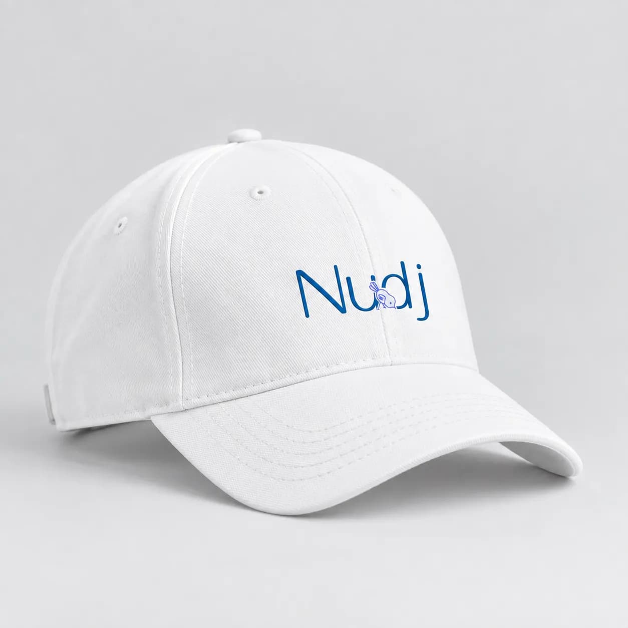
Nudj is a carbon-footprint app that nudges everyday choices toward a lighter footprint. frixB built the brand identity: a mascot mark, wordmark lockup and app icon designed around a single strategic problem — how to encourage behavior change without the guilt that makes people abandon climate apps within a week.
1 mascot
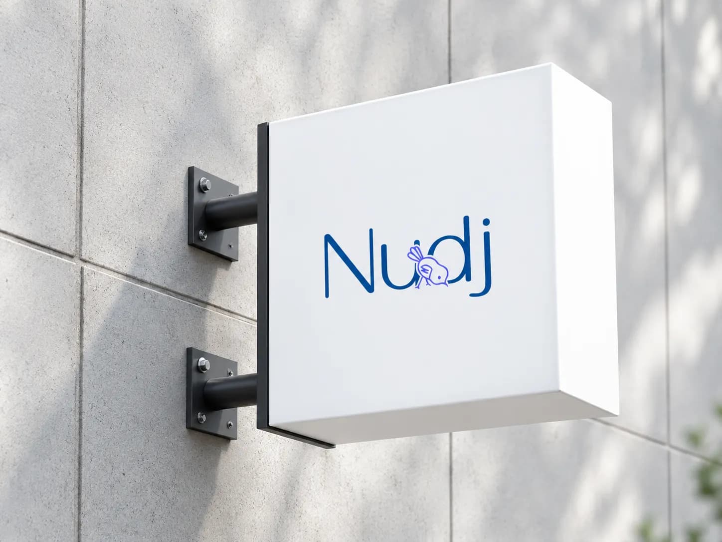
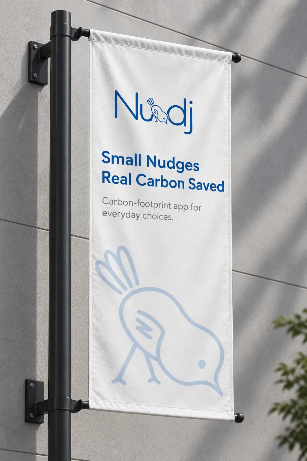
A single-line bird whose peck is the “nudge”
1 Color
A calm, trustworthy blue, not the default eco-green
TBD
Launch outcome — add once confirmed









Climate action that encourages, instead of guilt-trips.
The category default is green, urgent and faintly accusatory and it produces exactly the emotional response that gets an app deleted. Nudj needed an identity that reads as a supportive companion rather than a scold, while still being credibly about the environment.
- Rejected eco-green for a trustworthy blue: Green signals category membership and, in this space, judgment. A calm blue reads as reliable and supportive, closer to a helpful companion than an environmental authority.
- Made the mascot embody the mechanic: A single-line bird whose peck is literally the nudge. The brand’s core interaction and its mark are the same gesture, which makes the product idea legible before a word is read.
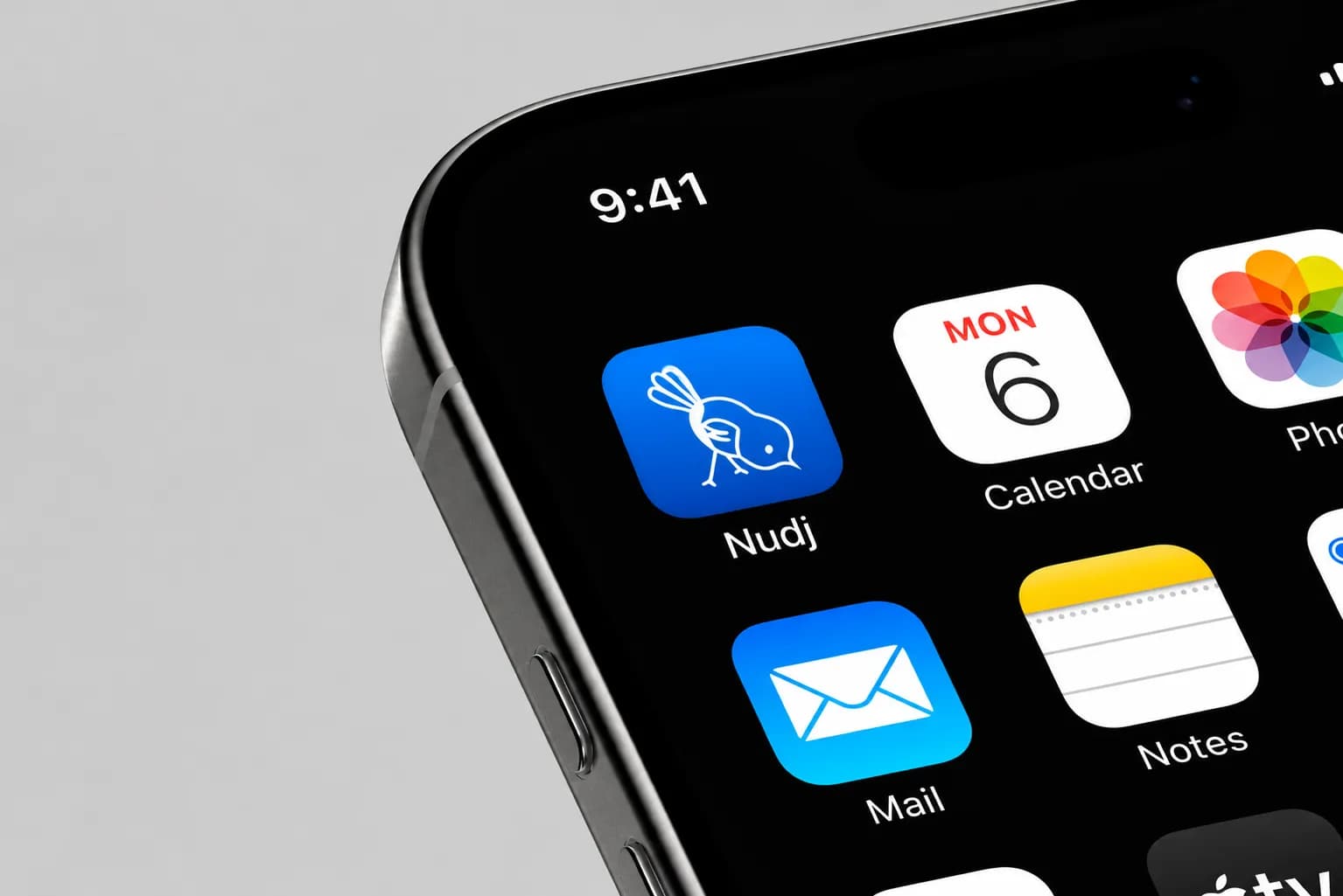
- Designed for the icon first: A single-line mark reduces cleanly to an app crop, so the identity is strongest exactly where consumer apps are actually seen.
- Set the tone rules alongside the marks: Encouragement over urgency was written into the identity as a voice principle, so the visual and verbal brand don’t drift apart once other people apply them.
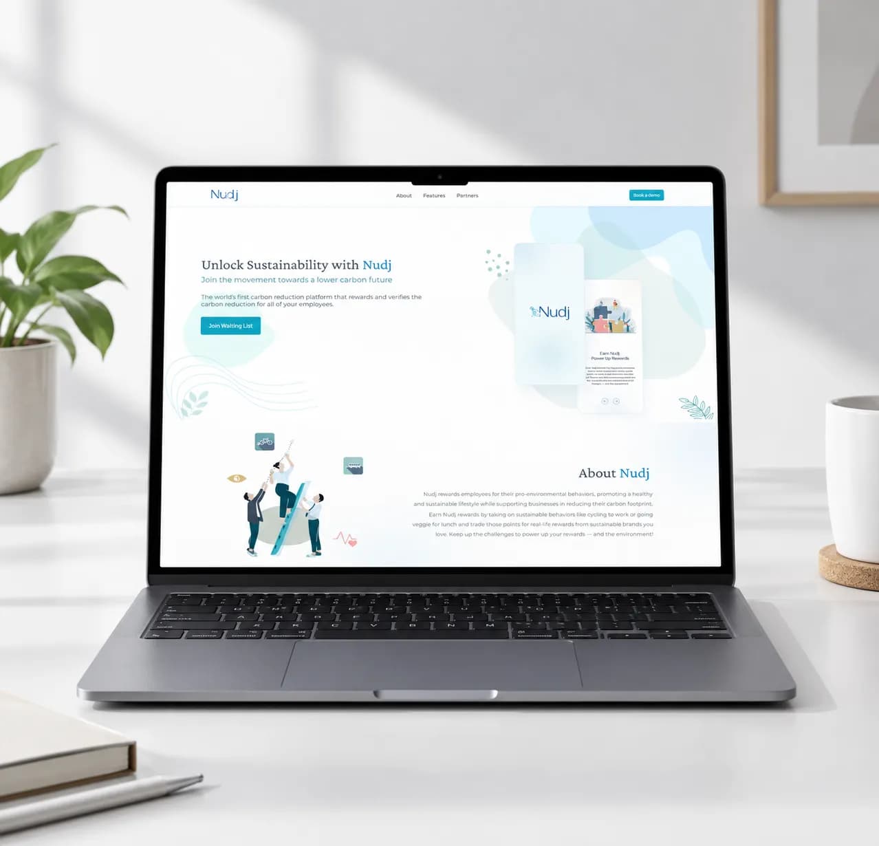
The strategic problem was emotional, not visual. So every identity decision was tested against a single question: does this encourage, or does it scold? The mark, the color and the tone rules were all resolved against that test rather than against category convention. AI assists the mechanical early passes; the judgement calls and the final craft stay human.
A blue climate brand.
Green is the expected, safe choice and would have signaled the category instantly. We rejected it because instant category recognition came bundled with the exact tone Nudj was built to avoid.
Trade-off: blue costs some immediate legibility as an environmental product, and buys a brand that feels like an ally rather than a lecture, the trade that determines whether the app survives week two.
A gentle mark that scales to an icon.
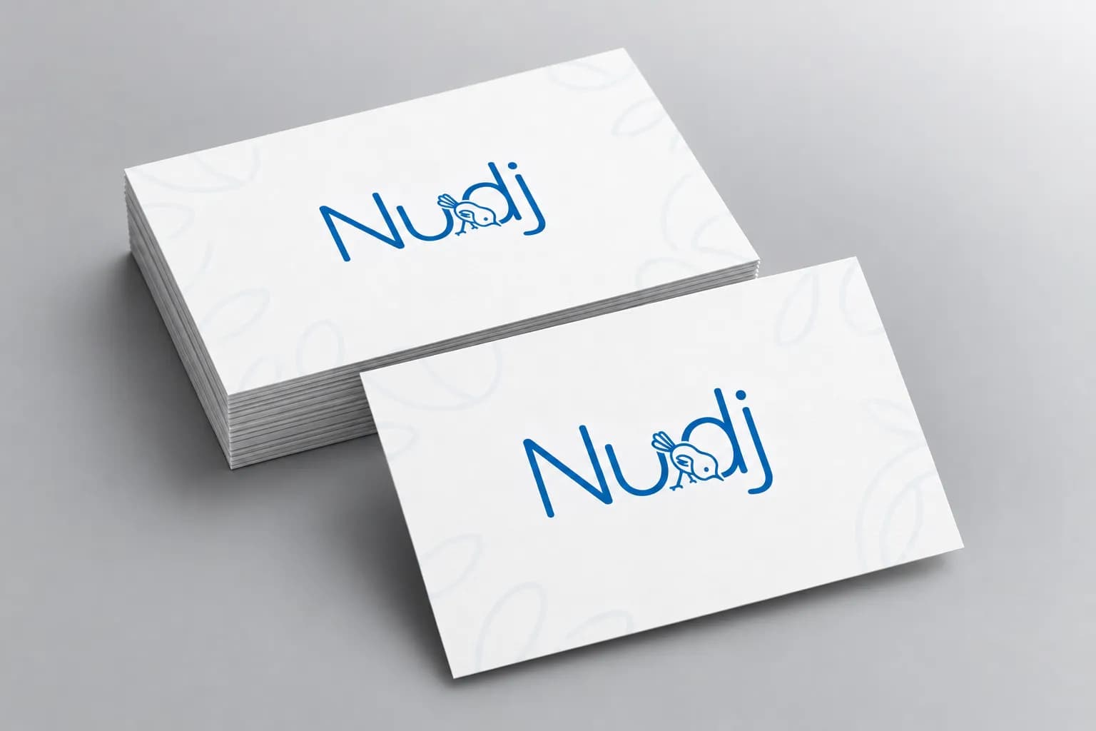
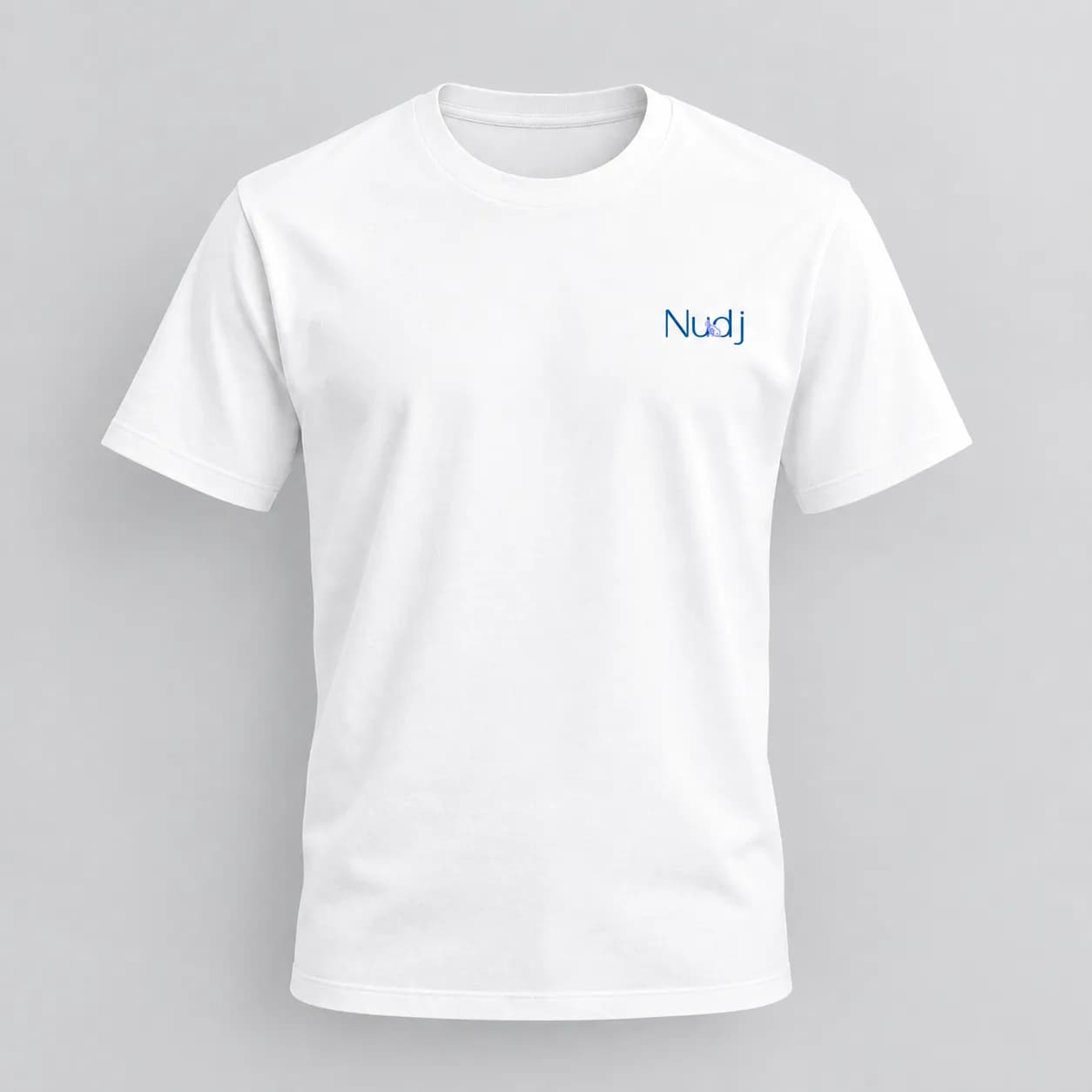
A single-line mascot mark, a wordmark lockup, a simplified app-icon crop, and a one-color system that scales from signage down to a home-screen icon.
All built around a brand personality of encouragement rather than urgency.
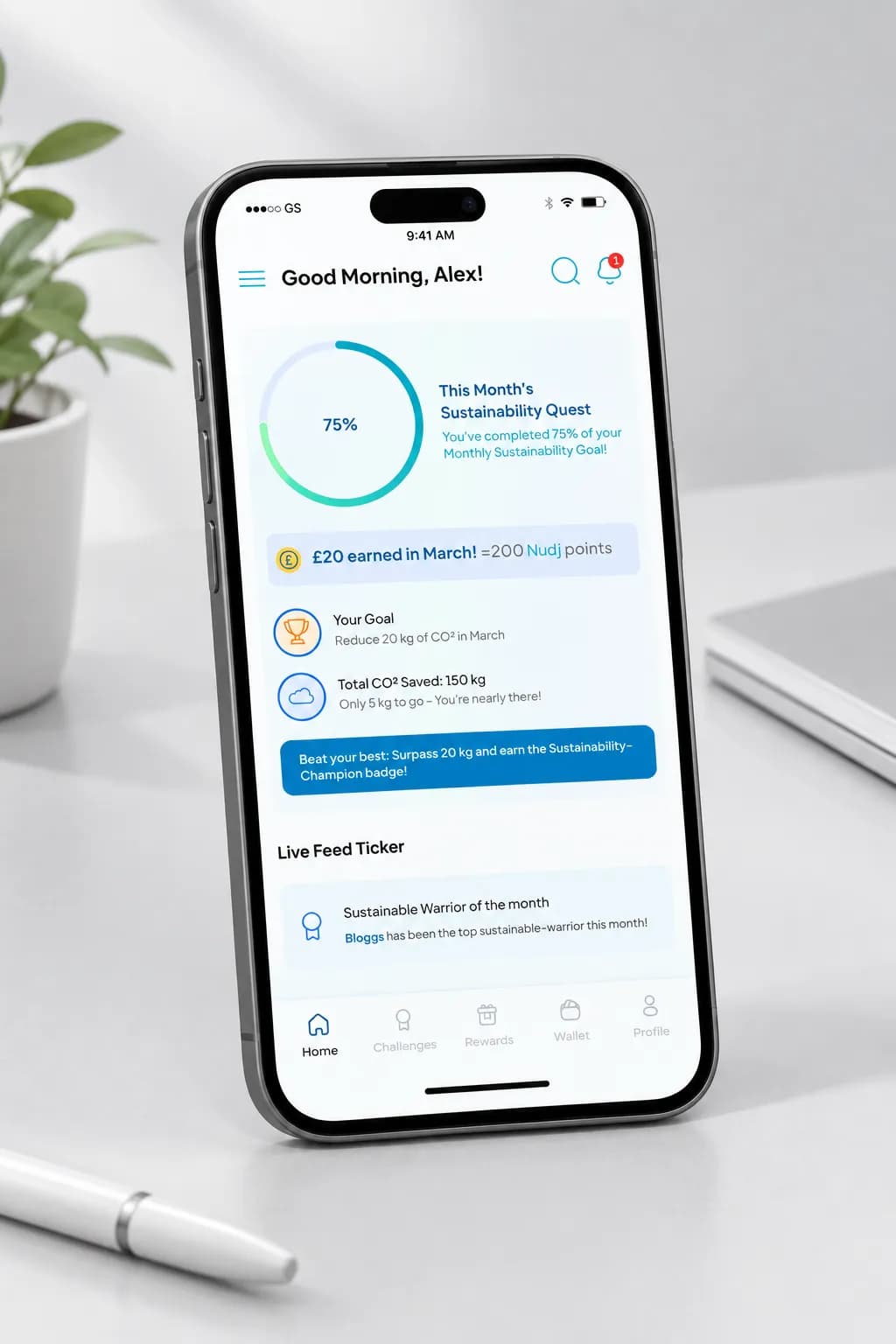
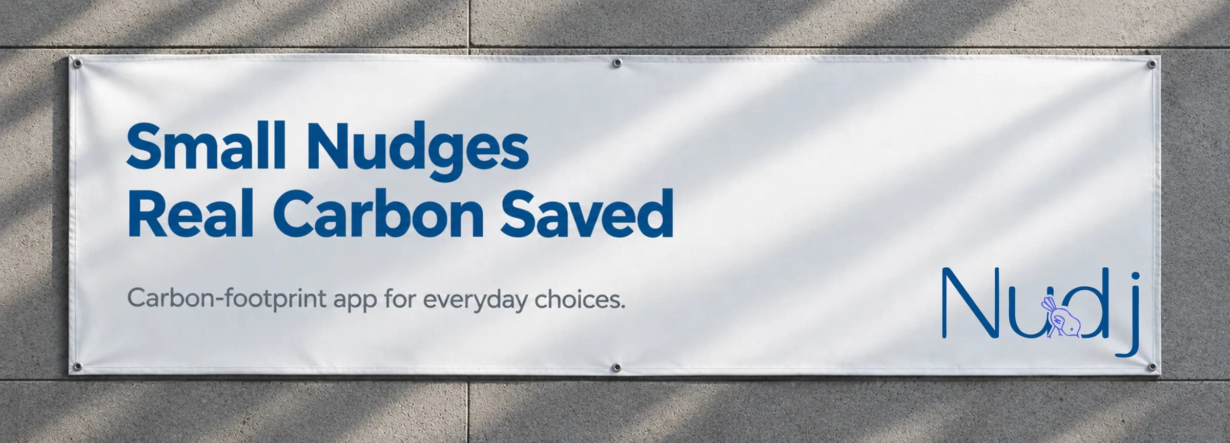
A climate brand that doesn’t scold.
A one-color system that scales from signage to app icon.
A mascot whose gesture communicates the product mechanic without copy.
Launch outcome pending: Awaiting downloads or retention data from the Nudj team.
Learnings & Next Steps
Choosing against a category convention is a positioning decision, not an aesthetic one and it has to be defended in those terms to survive client review. The open item is launch data: downloads or retention would let this page claim a real outcome rather than a design rationale.
“Great work! Thank you Rasa, thrilled by the final product of the rebrand.”

Need a brand that changes behavior, not just looks?